Connection ErrorBad RequestThis page went staleSession ExpiredSign in requiredForbiddenNot FoundToo Many RequestsServer ErrorBad GatewayService UnavailableGateway TimeoutHTTP Version Not Supported
Session Expired
Your session has expired. Please log in to continue.
Sign in required
You need an account to do that. Sign in or create one — it only takes a minute.
This page went stale
Your security token was rejected, usually because the page sat open too long or you signed in elsewhere. Nothing was saved. Reload the page and try again.
Request Failed
We encountered an issue while processing your request.
Please check your internet connection and try again.
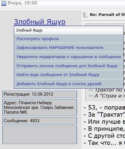
What's missing when you click on a user's name is "send a private message." I think there was also "ignore" and some other old features, but I can't remember them anymore, so they probably weren't that necessary.
Here's what was there.
Небо – мольбы не ждёт Небо – угроз не слышит Небо – ведёт особый счёт Небо – тебя найдёт
I don't know if this is intentional, but in classic mode all my fonts are about one and a half times larger than in the other two modes, which means very little fits on the screen. Also, the menu that opens when you click on your avatar in the top-right corner doesn't fit on the screen, and you can't scroll it (resolution 1080 lines, system scale 125%, the screenshot shows how much of it fits). I figured it's some kind of overly clever menu, because on mobile in "PC version" mode there are two menu buttons in the corner, but on PC they merge into one button and one menu for me.
And the menu that opens when you click on your avatar in the top right corner doesn't fit on the screen, and you can't scroll it (resolution 1080 lines, system scale 125%, the screenshot shows how much of it is visible).
Same here. It's only all visible when you reduce the scale.
Небо – мольбы не ждёт Небо – угроз не слышит Небо – ведёт особый счёт Небо – тебя найдёт
Is it really true that nobody else has had the scroll bug here?
In short, I don't know why, but in this thread on page 4, to scroll all the way down, you have to refresh the page (F5) and slowly scroll up with the mouse wheel while keeping an eye on the slider on the right — after a while, like a float, it drops down by several millimeters with a jerk. Please take a look if it's not too much trouble. Just want to understand whether it's only me or everyone.
This may not be important, but when you open a game section from "Games and Categories," part of the window is hidden behind the top panel, and you have to scroll with the wheel. And after refreshing the page, the section still remains covered — shouldn't it work properly by now?
It would be great to add a separate scrollbar there (like the old one had), or at least pin the tools themselves. When you're typing a long text, you constantly have to scroll up to change the font or color.
In the old editor, Enter worked as a line break; in this one, it works as a paragraph break. Because of that, without manual code modifications, it's impossible to remove excessively large gaps between lines where you don't need them. And a double space accordingly leaves too much empty space between lines.
Perhaps it makes sense, as before, to move preview and text editing into a completely separate standalone window. So that new messages wouldn't load in the thread simultaneously with it, and there'd be no risk of losing all information in case of an accidental refresh.
Many websites have a button with an arrow that appears in the bottom right corner when you scroll down the page; click it and you're instantly thrown back to the top. Quite a useful feature.
Is it really true that nobody else has had a bug with scrolling here?
I wasn't able to reproduce it.
Regarding the text editor -
It would be great to add a separate scrollbar there (like the old one had), or at least pin the tools themselves. When you're typing a long text, you constantly have to scroll up to change the font or color.
In the old editor, Enter worked as a line break; in this one, it works as a paragraph break. Because of this, it's impossible to remove excessively large spacing between lines where you don't need it without manual code modifications. And a double space accordingly leaves too much empty space between lines.
Perhaps it makes sense to move the preview and text editing into a completely separate standalone window, as before. So that new messages wouldn't load in the thread at the same time, and there would be no risk of losing all the information in case of an accidental refresh.
A separate page for the editor already exists — the button to the right of the reply button.
Could you make it so that topics are highlighted (with a slightly bolder and darker font, perhaps) when a new message appears in them? Right now, when offline and browsing the "Forum Activity" on the main forum page, as well as in the sections, topics are not highlighted at all, as they were on the old engine, and it always takes you to the last message in the topic rather than the first new one, as it did on the old engine.
When entering a login and password, it redirects to the main page of the site instead of staying where I am (in some forum topic) when entering them.
What I don't like about all these migrations to new engines is all these little things that were done thoughtfully back then for all users, which don't require any configuration — you just log in and everything is great — whereas on the new one, they are only implemented for those who visit the site/forum as registered users.
If you open any section under topics from "Forum Activity", the section opens, but after closing it with the cross and refreshing the page, the section is open again.
And messages are not merged together when you leave two or more in a row.
On the top panel (forum, news, wiki, etc.), if everything doesn't fit, a "...More" option appears, and at a large screen width, all sections spill out from there onto the panel. Could you attach this "...More" instead of "All Sections" on the third top panel, so that everything spills out in a pre-set order?



 Небо
Небо