Connection ErrorBad RequestThis page went staleSession ExpiredSign in requiredForbiddenNot FoundToo Many RequestsServer ErrorBad GatewayService UnavailableGateway TimeoutHTTP Version Not Supported
Session Expired
Your session has expired. Please log in to continue.
Sign in required
You need an account to do that. Sign in or create one — it only takes a minute.
This page went stale
Your security token was rejected, usually because the page sat open too long or you signed in elsewhere. Nothing was saved. Reload the page and try again.
Request Failed
We encountered an issue while processing your request.
Please check your internet connection and try again.
Error Details:
Share Link
Posts from Discussion about the Dungeon faction.Auto-translated
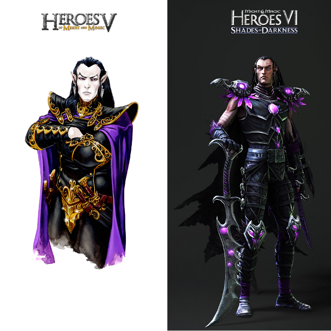
After reviewing the concept art for the Shadow League army, I'm once again convinced that they're cutting corners on the expansion pack.
The Assassins are clearly drawn after a change in developers. It looks more like a sketch than a finished drawing.
The basic Stalker and its upgraded version were definitely created by different artists. The upgrade was created back in 2011, and the concept art even features an outdated game logo. In the overall drawing, it's noticeable that the basic version seems to be cobbled together from whatever was available, with a lot of smoothing (or whatever it's called). It's qualitatively inferior to its upgraded version, which it's based on. And, by the way, as mentioned before, the upgrade has inexplicably turned gray.
The Spectators are in the same situation. The upgrade is the primary version, and the basic version is derived from it (this is especially evident in the area of the main eye and on the ends of the tentacles, where attempts were made to smudge the eyes).
The Faceless Ones, again, are assembled from whatever was at hand. When you zoom in, it's immediately obvious.
The Minotaurs are a bit more complicated. There's a first upgrade and a reworked second one. I'm not sure about the creation of the basic version, but something tells me that it originally had something in common with this creature (this Minotaur even has different horns).
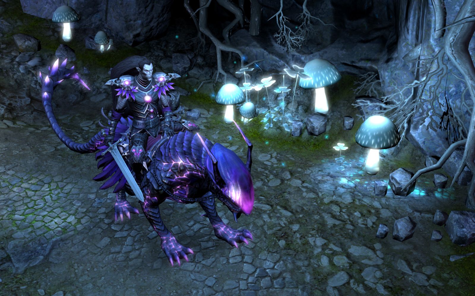
The situation with the Manticores is also not entirely clear. There's a original drawing that served as the upgrade, and a basic version that doesn't quite resemble it... But in terms of quality, the basic version again looks more like a draft.
The dragon is straightforward. They took the leader and turned him into the faction champion.
In conclusion: there's an obvious cost-cutting effort. Add to this the fact that materials from the fifth and sixth installments are being used in the "Might & Magic: Duel of Champions," "Might & Magic: Heroes Online," and "Might & Magic X" projects (a little, but it's there) – and you get a cost-cutting measure on the brand as a whole.
Faceless, again, were put together from whatever was at hand. Everything becomes obvious as soon as you zoom in.
Sigh, I'm going to defend the honor of Igg-Shail's Faceless... for example, with THESE Faceless, everything is just fine for some reason. NO SLAPPED-ON TEXTURES. INCONSISTENCY! 1-0. The base Faceless model was made back for the release of the original game; all that was left was to slightly... uhhh... "upgrade" it to make an upgrade :D :D . 2-0. The animation of the Faceless is PERFECT (well, except for their movement, which was copied from Dark Elementals, of course). 3-0. How are we going to respond to that, huh?
Added after 2 minutes Adagio, the people from heroes6.ru are unhappy with you:Raelag;25329
I might be wrong, but what difference does it make how the drawings look? More accurately, what difference does it make how well they are drawn if it doesn't affect the models themselves in any way? Or does Adagio believe that if the drawings don't look the way he wants (personally, I liked them), then the models in the game will be blurry and ugly? If a person is nitpicking about the base and upgraded models being so similar, well, you know how that sounds. As for the cost-cutting, that's obvious. Ubisoft doesn't have high hopes for Heroes since it's a strategy game. The hope here is for M&M 10. If it brings in profit, then the brand as a whole has a chance. If not, everything could end quite sadly.
With THESE faceless textures, everything looks normal. NO STICKY TEXTURES. IT'S GREAT!
No, I see it, although it's harder to notice on a small picture, but it's there.
Regarding saving money, that's obvious. Ubisoft doesn't have high hopes for Heroes, as it's a strategy game. Their hope lies in M&M 10. If it brings profit, then the brand as a whole has a chance.
Ah, I'll be defending the honor of the Faceless Ones of Igg-Shail... but with THESE Faceless Ones, everything is fine. NO STICKY TEXTURES. It's perfect! 1-0.
The image has too low a resolution to judge anything by.
The animation of the Faceless Ones is PERFECT (except for their movements, which are copied from the Dark Elementals, of course). 3-0.
Firstly, the animation can no longer be called perfect, and you yourself pointed out the reason. Secondly, I suspect that most of the models, and therefore the animations for them, were developed in 2012. It would be strange to see something angular and unsightly, wouldn't it? Technology allows for the preparation of high-quality material.
Adagio, people from heroes6.ru are unhappy with you:
Which is quite natural. There are as many opinions as there are people.
I may be wrong, but what difference does it make how the drawings look? More precisely, what difference does it make how well they are drawn if it doesn't affect the models themselves? Or does Adagio think that if the drawings don't look the way he wants (I personally liked them), then the models in the game will be blurry and ugly?
Firstly, I didn't even mention the quality of the models and their connection to the concept art. Secondly, my personal opinion is this: the project's concepts are also a very important part of it, a kind of reflection of the developers' attitude to the work. At worst, it's an aesthetic issue... These images will appear in the game (bestiary, hiring window), so I would like to see content at the level of the initial one (an example of an excellent drawing, done with care: just look at the amazing light and shadow, the consistent color scheme, the neat execution), otherwise there is too much contrast. Although, I think that in comparison with the introduced city screens, the images of the League of Shadows are just a small thing, as they say. In general, I don't understand this attitude towards concept art, especially this question:
I may be wrong, but what difference does it make how the drawings look?
It is an integral part of the project, its creative core, and it should not be neglected. IMHO, of course.
If a person is complaining that the basic and upgraded models are so similar, then you understand how that sounds.
That's not what I was talking about. I was talking about the quality of the contrast between the basic and upgraded versions of the creatures. About the similarity. Most of the upgrades in "Heroes" are similar to the originals, so it would be extremely stupid and inappropriate for me to complain about it. Which I didn't do.



 Граф Орлов