Skip to content

Posts from City screens. Auto-translated

No ratings yet — be the first to rate!
Open
Which faction’s town screen did you like the most?
32 voters
Single choice Public votes
Sign in to participate in this poll.
Poll results will be visible after you vote or when the poll closes.
User Avatar
#1
Auto-translated
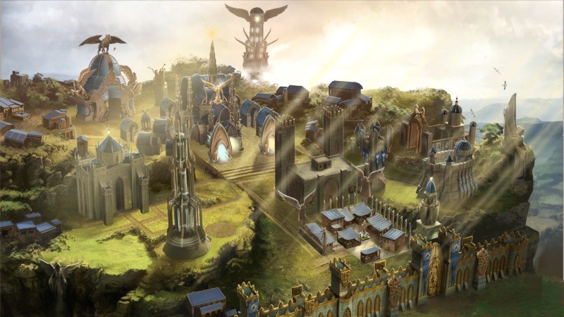
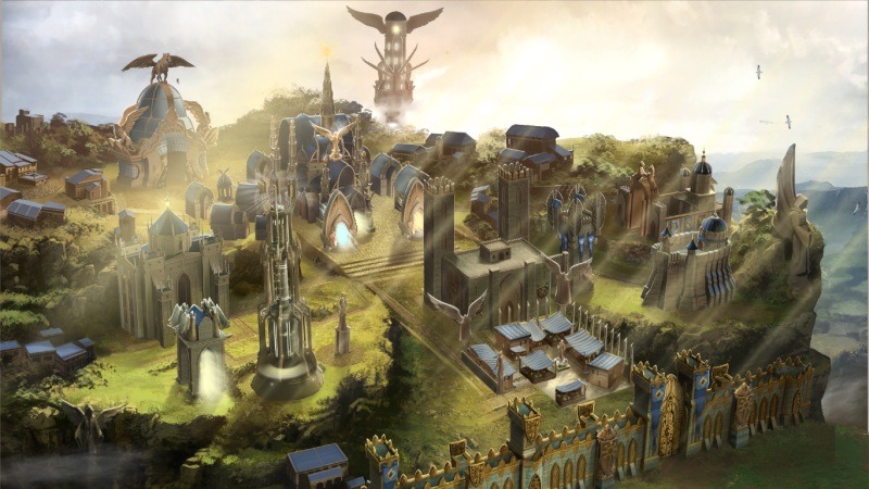
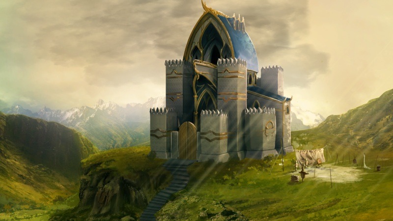
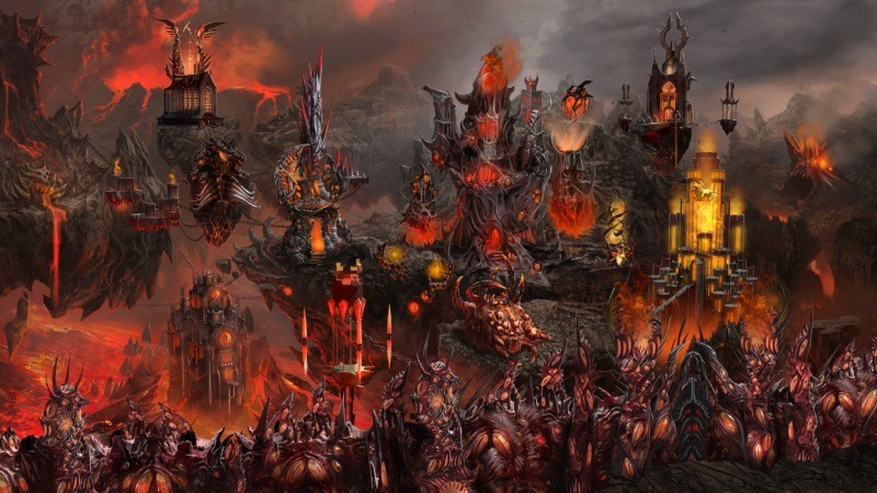
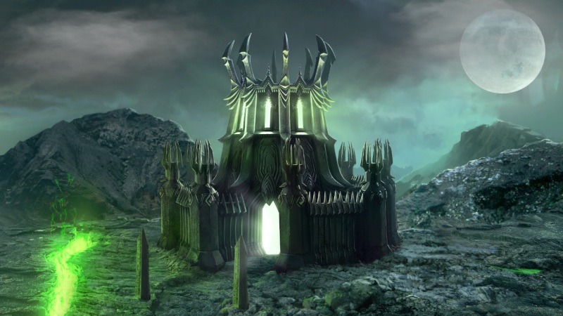
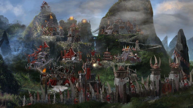
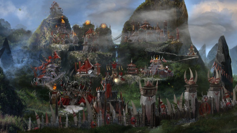
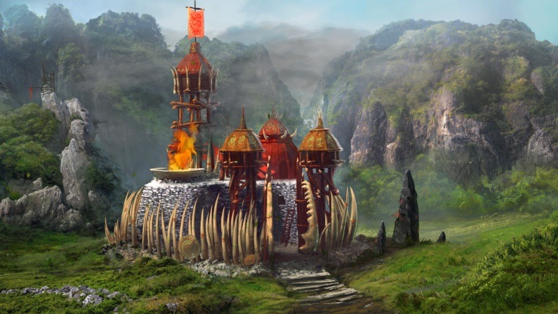
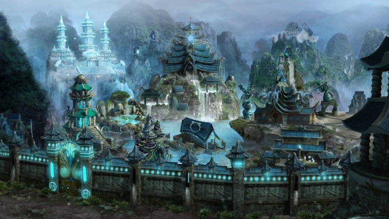
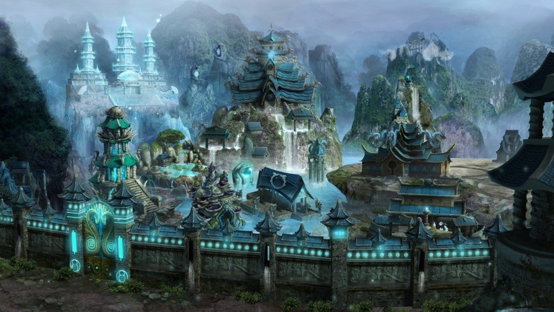
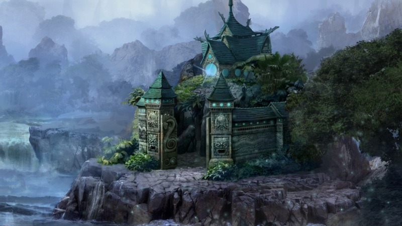
In this topic, I propose we discuss the town (and fort) screens added in patch 1.5. Below, you can find screenshots of all the new screens via the links.

Haven (first version of unique buildings)
Haven (second version of unique buildings)
Haven Fort
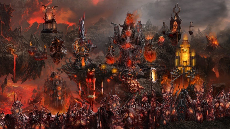
Inferno (first version)
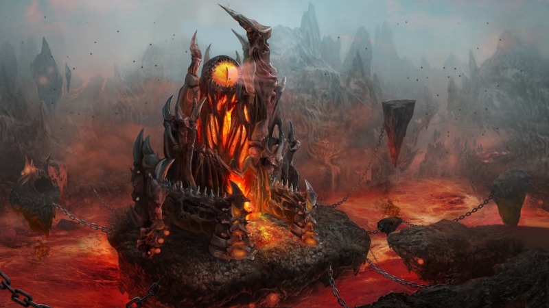
Inferno (second version)
Inferno Fort
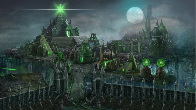
Necropolis (first version)
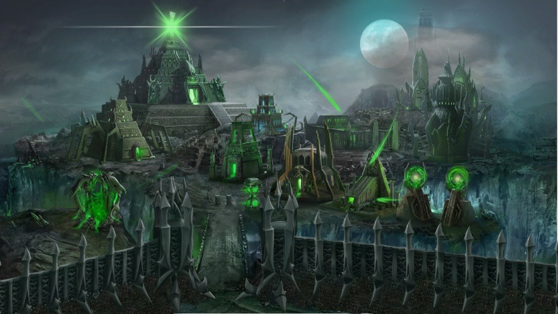
Necropolis (second version)
Necropolis Fort
Stronghold (version 1)
Stronghold (version 2)
Stronghold Fort
Sanctuary (version 1)
Sanctuary (version 2)
Sanctuary Fort

I will add screenshots of the Tears of Ash building later.
Карты для Heroes of Might and Magic V
Цикл "Закадычные враги": "Особенное гостеприимство, "Супероружие", "Меж молотом и наковальней"
"Падение Шантири"

Кампания для "Кодекса Войны"
"Выбор Сагиттеля"

#2
Auto-translated
What is there to discuss? This could have been done right before or immediately after the release: a background image and clickable images on it. It's based on the design from Heroes of Might and Magic III, but while those background images looked organic in Heroes III, they are completely out of place here, considering the overall design of the game and the differences in release dates...
I liked the city overviews in Heroes of Might and Magic V, and something similar should have been done in Heroes of Might and Magic VI. But the style of Heroes VI should have been retained (less cartoonish). As it is, it's a complete failure.
..изведать то, чего не ведал сроду! глазами, ртом и кожей пить простор! кто в океане видит только воду, тот на земле не замечат ГОР
User Avatar
#3
Auto-translated
Actually, they look more organic in the game itself than in the screenshots.
But you still need to get used to it, as I'm already used to small screens.
On the other hand, when you enter a town, it creates a certain feeling of comfort, as if you're not just looking in through a window from the street, as it used to be, but everything here is familiar, and they've even added a matching door.
But again, I liked in Heroes 5 that you could rotate them, and the panoramic view of Haven in the rays of the setting sun is just beautiful.
It's a little unusual that some buildings don't stand out after they're built – but that's a legacy from previous games, and you can get used to it too.
User Avatar
#5
Auto-translated
Inferno looks very impressive. It’s my favorite.
In reply to Реммор
User Avatar
#7
Auto-translated
Remmor

I liked the city overviews in Heroes of Might and Magic V, and something similar should have been done in Heroes of Might and Magic VI. But the style of the sixth game should be preserved (less cartoonish). Otherwise, it's a complete failure.

I completely agree. The cities in Heroes of Might and Magic V were excellent, with beautiful overviews and musical themes that were simply magnificent:smile54:
User Avatar
#8
Auto-translated
either Necropolis or Haven, voted for Haven.
User Avatar
#9
Auto-translated
simple pictures are nothing special, they look nice, but as city screens, it's

Moderated: INAPPROPRIATE LANGUAGE in the message

s...t
:smile18: :smile18: :smile18: :smile18:
Маласса ждёт...
Маласса знает...
Маласса за всеми наблюдает...
User Avatar
#10
Auto-translated
What I like about the Inferno castle is that it has a great style. I also liked that in Haven and the Barbarian Tribes, the buildings look harmonious next to the background, even blending with it. In Necropolis, I think the buildings are too "stuck on." And I already talked about Haven. What I don't like about all the cities is that the building for hiring champions is almost always smaller and less impressive than the other creatures' buildings. Also, there are few differences between the upgraded and unupgraded buildings. The Capitols don't reach for the sky :(. In general, the forts are the same. Although I don't think they need city screens. A 3D window would look good with the 2D city windows, emphasizing the differences between the statuses of these two objects. I voted for Haven. I like the thoughtfulness of this castle. The gates are beautifully drawn :). I would put the Inferno and Barbarian Tribes castles in second place. And Necropolis in third. They really tried to ruin Haven, though. Although all the screens in the game look good, including the human one.
Карты для Heroes of Might and Magic V
Цикл "Закадычные враги": "Особенное гостеприимство, "Супероружие", "Меж молотом и наковальней"
"Падение Шантири"

Кампания для "Кодекса Войны"
"Выбор Сагиттеля"

#11
Auto-translated
I liked all the city screens. I was really happy when I found out. And I don't understand why people criticize them. Of course, they could have made something better, but they still look great.
I liked the Inferno screens the most. I have no words. It's pure hell. And there's nothing more to add.
Then comes the Haven. And anyone who "bashing" them clearly doesn't understand architecture. It's done according to all the canons of medieval castles. It's a very cool reconstruction, everything is clear, beautiful, and most importantly - correct.
The Sanctuary and the Stronghold look great and are pleasing to the eye.
I liked the Necropolis screen the least. It somehow bothers me. I don't know why.
User Avatar
#12
Auto-translated
The problem is that instead of a Haven castle, it turned out to be a village. But what really bothers me is the small tower in the background, which, as it turns out, is the dwelling of angels.
Карты для Heroes of Might and Magic V
Цикл "Закадычные враги": "Особенное гостеприимство, "Супероружие", "Меж молотом и наковальней"
"Падение Шантири"

Кампания для "Кодекса Войны"
"Выбор Сагиттеля"

User Avatar
#13
Auto-translated
The Sanctuary looks great.
The others are fine.
But with Haven, as soon as I saw it, it reminded me of Happy Farm. :)
#14
Auto-translated
Regarding the comments about the rustic style of the Haven screen: I won't make any definitive statements, but the audio file from the game's database, which serves as background music for the human town (Data3.orc/Sound/build_sounds/Building/HavenTown_Ambient.wav), does indeed resemble a farm in some parts. It is quite possible that the developers themselves initially adhered to a similar concept.

About the new screens: they are terrible from start to finish. Personally, I liked the previous ones much more.
User Avatar
#15
Auto-translated
Well, as I expected, I got used to it.
Now everything is fine. The visuals are pleasing to the eye, and that's good.
While playing the last mission for Haven, I got a good look at the town, and I even started to like it. It really is a quiet village, but first impressions can be deceiving – behind the modest, in terms of monumentality, buildings, lies a formidable force. And the elaborate architecture once again proves that the people are jacks-of-all-trades and pioneers in everything, both in battles and in peaceful endeavors. :)
However, if you look at various churches, say in St. Petersburg, the elaborate decorations of those temples are no worse.
There are some flaws, though.
When you upgrade the town hall to a capitol, additional houses appear in the center, but the paved road doesn't change its appearance, i.e., the house stands with one edge directly on the road.