

 Ment
Ment
Auto-translated
Not very impressive. In my personal opinion, the musical accompaniment is simply terrible.
Cons:
- When a hero's turn ends, the cell's highlight color doesn't change and remains green. That's quite a bug. It seems like it should be fixed in just a couple of minutes.
- They've created an interesting building tree, but... it doesn't look very good. Especially the decision to use the icon of a barracks or similar building: instead of the building icon, we see the icon of a unit. It's good for clarity, but they could have implemented this clarity in a different way...
- The unit recruitment interface still doesn't appeal to me personally. Just add some animations; otherwise, it looks too much like some browser game in this aspect.
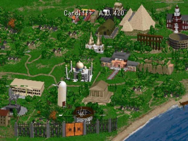
- A cute town. With a very strange cartoonish animation. Seriously, those drawn, animated waterfalls look very strange. It's probably not worth saving money on 3D towns, in my opinion. Yes, there are a lot of resources. Yes, after the fifth game, no one pays attention to them anymore. But such towns blend harmoniously with a 3D game and don't look gaudy against the rest. And yes, it's 2015. Seriously. The city view was present even in the second (!) Civilization. The second, I mean, Civilization! A game from 1996! And after 19 years, the largest gaming corporation claims that it doesn't have enough resources for this. We've gone down the wrong path somewhere...

- Another bug (?). In battle, when there is no city siege, the catapult is still displayed. It's even on the initiative scale, but it has to skip its turn all the time. Hmm... it's kind of silly.
- When capturing buildings on the global map, we see a sword icon, as if it were an attack icon. Why, if they aren't even guarded?
What I liked:
+ It seems like I saw hints of DialogScenes, like in the fifth game. In the video, there were clearly not pre-rendered scenes with a group of human units and a hero in the center. If this guess is confirmed, it will be great.
+ They've brought back the rotating camera. It's a small thing, but it's nice! When I played the sixth game, I suspected that I was being deceived and that the game was actually pseudo-3D, with all the models drawn only on one side :D Just kidding.
+ Overall, it looks quite beautiful.
+ As seen in the screenshots above, the maps are now filled with objects. At first, it was very empty, like in the sixth game, but now it's acceptable.
+ The skill wheel, although not as good as in the fifth game (in the sense that it works differently), still looks quite harmonious.
+ They've brought back the log on the top left and the reminder list on the right, a la AoW3. These are small things, but they are pleasant.
+ In reconnaissance mode, it shows how the arrangement of units buffs the neighbors. However, I've seen this somewhere before, perhaps even in the sixth game... But I don't remember, I might be wrong.
+ Flank attacks seem to work.
+ (see attachment) Will we finally be rid of the eternal crutch of having only one unit for weak heroes? Although, this also reveals a small drawback: the unit exchange interface is not very good; there are no buttons at all. I don't mind using Shift to divide, but it's 2015 after all...
Overall, I would say that I really like what I see. With the exception of the controversial interface. There are some obvious bugs, and there are just controversial things (which I personally still hope will be fixed :rolleyes: ). But in any case, apart from the interface, I don't see anything that I would criticize right away. Seriously.
*I take back my words. The global map looked good, but the battle with the academy was a mess