 Ment
Ment


Auto-translated
Good day, thank you for your work.
In the new message window, the "remove formatting" button doesn't seem to always work. For example, I removed bold and subscript text, but it won't remove hyperlinks.
Regarding the main page changes: I haven't logged in from my computer today, but it's difficult to browse the forum on my phone. Overall, the interface has become very heavy, and many things don't fit on the screen.
Here are some details:
Screen resolution is 2880×1440. Browser – Chrome, slightly older version.
This is how my favorite "Top 50" statistics section looks, which I usually use to view new messages (in the regular "top 10" at the bottom of the main screen, it's easy to miss something). This thing cannot be scrolled horizontally on a phone; topic titles and section names simply don't fit on the screen.
[img=600x1089]https://forum.heroesworld.ru/attachment. ... 98684321[/img]
This is the list of forum sections on the main screen:
[img=600x995]https://forum.heroesworld.ru/attachment. ... 98684321[/img]
Suggestion: On phones, all these descriptions of sections aren't needed; they can be removed (or optional super-short descriptions specifically for mobile devices could be added?). It would also be good to reduce the empty space between display elements.
Here's what a user message inside a topic looks like:
[img=600x1071]https://forum.heroesworld.ru/attachment. ... 98684321[/img]
[img=600x1085]https://forum.heroesworld.ru/attachment. ... 98684321[/img]
In my case, the message takes up one and a half screens. I don't know, but something needs to be done at least with the block containing the avatar, registration information, etc.; it shouldn't take up half the screen. Maybe display user info to the right of the avatar instead of below? Also, current forum signatures seem poorly suited to the new mobile style.
A few more points about sections on the main page:
[img=600x995]https://forum.heroesworld.ru/attachment. ... 98684321[/img]
The Top 10 statistics section on the main page is also not very convenient compared to the Top 50.
[img=600x992]https://forum.heroesworld.ru/attachment. ... 98684321[/img]
And this is what I'm struggling with right now – the message editor. It's quite difficult to insert large images, and even harder to write text after them. The screen scrolls, but the scrollbar isn't fixed and immediately moves elsewhere for any reason. See:
[img=600x995]https://forum.heroesworld.ru/attachment. ... 98684321[/img]
I have to create empty lines in advance under the image; otherwise, placing the cursor below it (to the right of it) becomes an almost impossible task.
Forum header:
[img=600x994]https://forum.heroesworld.ru/attachment. ... 98685917[/img]
Maybe group these buttons into pairs or even triplets? I don't think there's a need for each button to take up the entire width of the screen.
And here's a table with pictures (see the "Vistéria" topic in the "Forum Games -> Expedition" section):
[img=600x986]https://forum.heroesworld.ru/attachment. ... 98685649[/img]
That two-pixel girl in the left column is actually a full-size picture. Technically, the forum doesn't have BB code for tables, so this is HTML, and perhaps fixing it by setting a fixed size for the image in the tags could work... But still, it's an unpleasant use case.
So that's how it is. Of course, some things, like the visual message editor, look interesting, but overall, accessing the forum on my phone has become difficult...
In general, the most important suggestion is a checkbox or link labeled "desktop view mode" in a prominent place, so that you can immediately disable adaptation for screens from your mobile device if it isn't working correctly (even if it starts working correctly in most cases).
Thank you again for working on all of this.
-----
Oops... As you can see above, images with sizes specified in them are not displayed (but they are displayed in the visual editor). But they are all embedded in the message, just in case.
-----
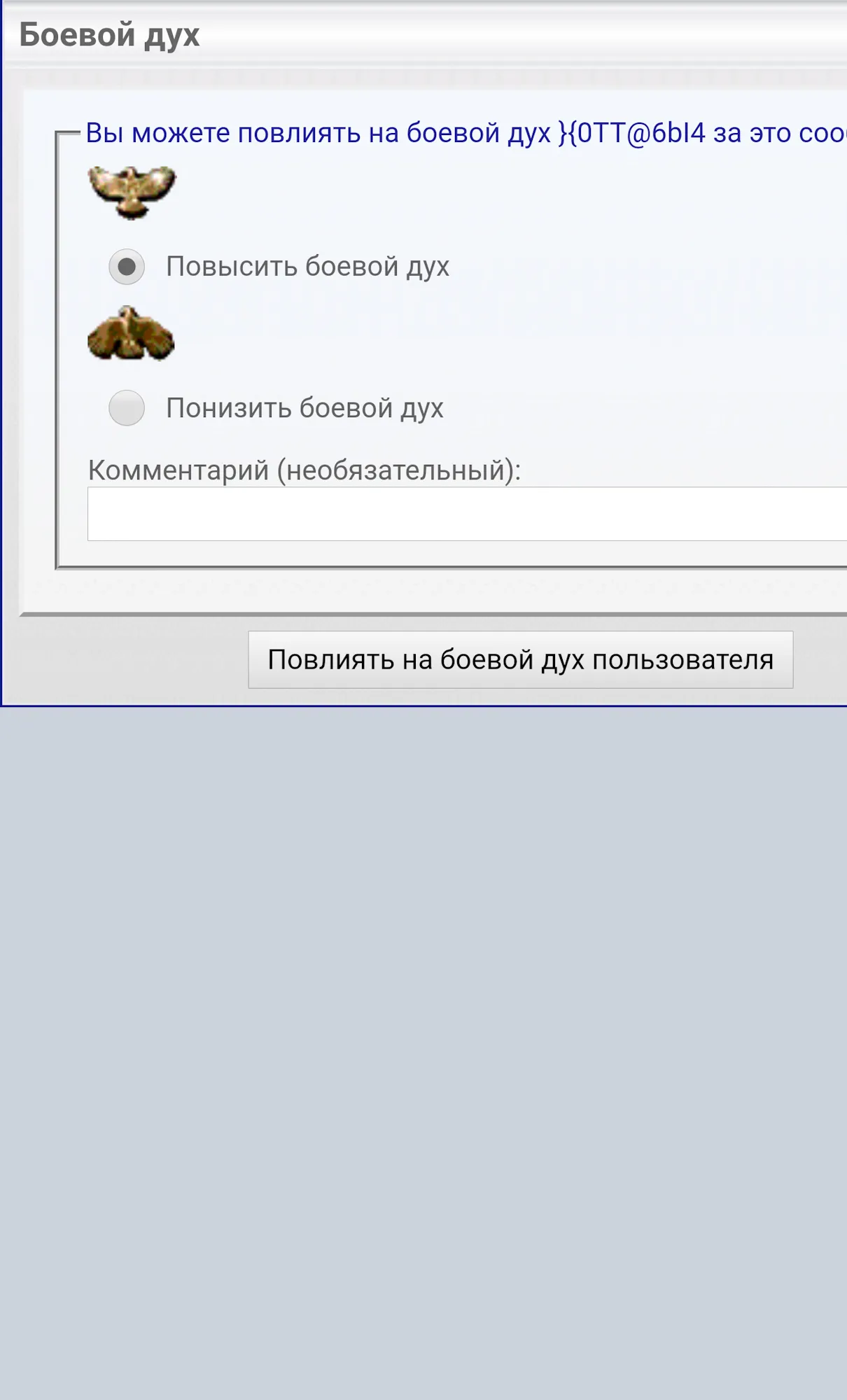
Another addition: The interface for changing morale does not fit on the screen.