Posts from Teikoku Kagekidan
2. 9 Join the guild, warrior, and let's protect the peaceful citizens from the annoying undead! But even if it doesn't work out, and you get eaten by rats in the basement, don't worry, there's a nice little spot right here behind the trees...
3. 8 It's simple, but I could hang out here.
5. 5 The Castle is just a Castle, not very interesting.
6. 7 Let's add a bit of exotic flair.
7. 5 Hmm, what exactly are we supposed to evaluate? The view from the window? It's not clear. It's a decent picture, but it would be better for a different contest. The atmosphere is actually quite nice.
8. 5 We had a good flight, but the landmark didn't appeal to me, and it feels a bit bleak. The monotonous cityscape stretches to the horizon.
9. 5 It's not about terriers, but about the landscape. The city is somewhere in the distance and blurred. How can I evaluate this? The landscape is pleasant, though.
10. 7 Well, it's okay, although I probably wouldn't want to stay here for long.
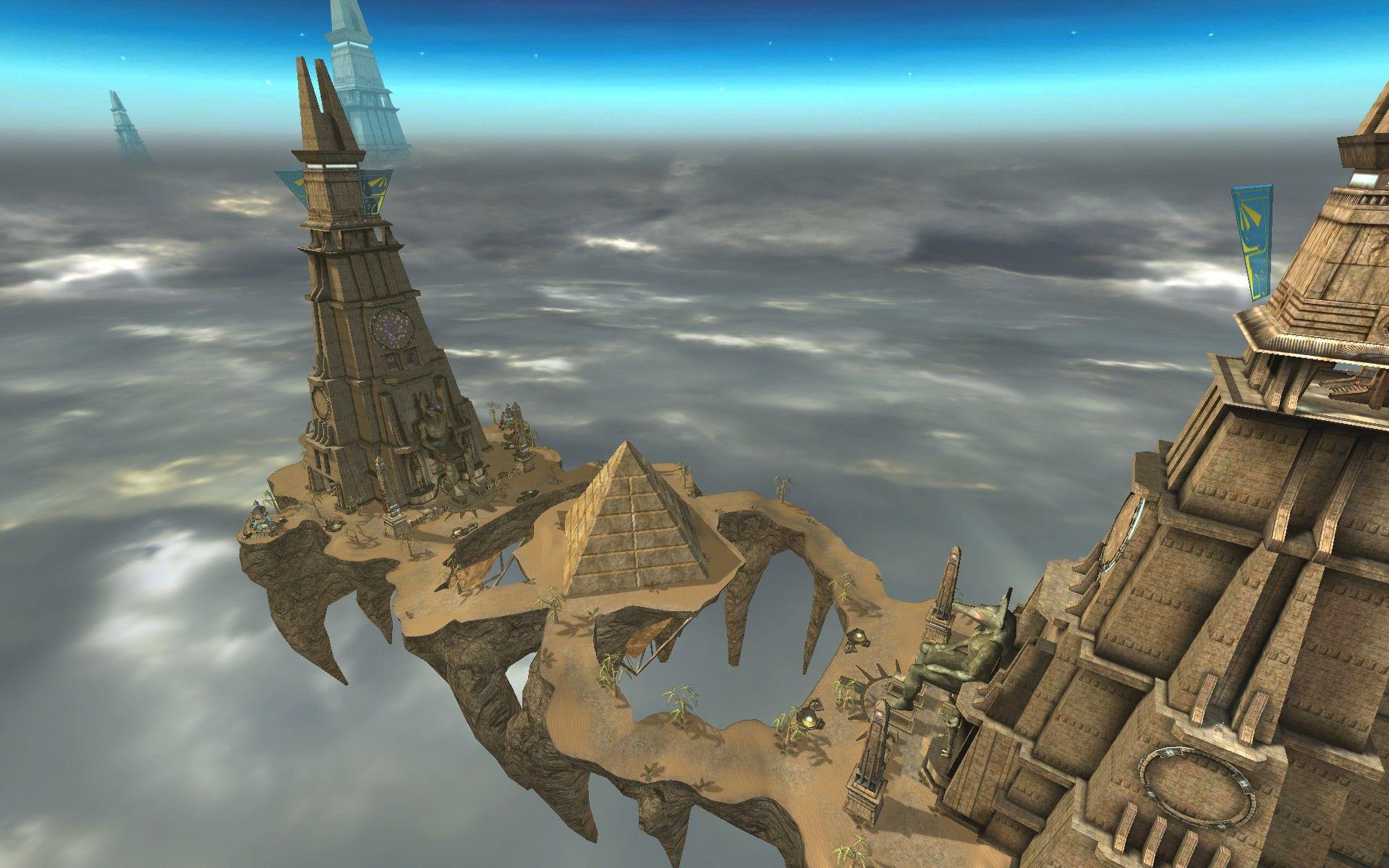
11. 7 Oh, Unreal! But there are prettier versions of this map. For example, here is one I used to enjoy playing...
Added 1 minute ago
I
8/10
II
7/10
III
5/10
IV
7/10
V
6/10
VI
7/10
VII
8/10
VIII
6/10
IX
6/10
X
9/10
psi-trance
Небо – угроз не слышит
Небо – ведёт особый счёт
Небо – тебя найдёт
It's something like this.
a reference to Planach
-Gender reassignment surgery.
Where do we end up when we save the world?
2 - 6. Nice, but generic.
3 - 4. I don't really like medieval taverns.
4 - 7. A bit gaudy, but epic.
5 - 8. I don't like the colors and I'm not a fan of this kind of architecture, but overall, it's my style.
6 - I wanted something futuristic, but I couldn't find anything on that topic that was good enough to really wow me, unlike this picture.
7 - 6. It's a bit sad and I don't really like the architecture, but it looks cozy.
8 - 9. I would make the color scheme more vibrant and diverse, but I like this overall.
9 - 8. Overall, it's my style, but it's a little boring, like 5.
10 - 7. It's quite pleasant, but nothing more.
11 - 5. It's a bit poor, I don't really like the colors, the plot itself is not bad, but the execution is terribly lacking.
🏹🎪+⛓️♿=💕
2 -- 3 What is this? Why is this structure in the middle of a dense forest? Why is everything so garish? Why, for God's sake, is a residential building placed on top of a stone tower? Only a point for the graveyard.
3 -- 5 I've seen better taverns, but it's passable for a drunkard.
4 -- 3 The structure on the left is decent, but everything else is not very good. Too bright, fragmented, and it's not even clear what these structures are and where to look.
5 -- 7 A common problem – the artist doesn't understand how castles were built. This is generally forgivable, although it's like drawing people without knowing where their joints and bones are, but in this specific case, it seems that the artist also has a poor understanding of the purpose of a particular building. The result is a mockery of logic. Nevertheless, the texture and color scheme are good, and in general, the silhouettes are beautiful and correct.
6 -- 4 Mech.
7 -- 3 Is this about the interior or the concrete boxes in the background? Either way, there's nothing good about it.
8 -- 8 Modern Gothic – excellent, the colonnades are also not bad. The somewhat stretched layout and the warm color scheme just didn't work.
9 -- 4 See 5, and then add more color and absurdity. It seems to me that the picture is more about the landscape.
10 -- 6 Not minimalist enough – it would be better to remove the excess clutter from the corners, and the modernization was unnecessary. I would give a higher score to a classic Japanese style.
11 -- 4 Strange stone blocks in the void
e si ieu muoir, er mi grans deliuriers
I wish there were more contests like this! But I also like the human ones.