Skip to content

Posts from NHF – new heroes for Heroes V 3.1.

4.9 (16 ratings)
In reply to SRD
9 years ago
Auto-translated
SRD
I haven't seen anything like that, but disappearing at the beginning and reappearing at the end without visualizing the movement itself would prevent the ability to stop halfway if needed.
I had an idea to create a Warlord based on a Necropolis unit - Incubus - a vampire with the texture of Agrael and the helmet of the Warlord.
What makes you draw such conclusions???))) You can see the path of his movement, and the "skirt" (I think that's what it's called) moves. I specifically left the skirt so that you can always press the brake at the right moment!:D
In reply to Роман RRR
User Avatar
9 years ago
Auto-translated
Torefin. As promised, I reworked the shoulder pads a bit. The client requested a dark cyan color for the scales, and I think I got it right.
Attachments 1
1 file attached • Total size: 777.5 KB
In reply to SRD
User Avatar
9 years ago
Auto-translated
Maybe the shield’s scales could have been made black; otherwise, it looks too much like Vayron’s.
In reply to SRD
User Avatar
9 years ago
Auto-translated
SRD
Perhaps the scales on the shield could have been made black; otherwise, it looks like Vayron.
Something like this!
Which looks better – with purple or black? I think black.
Attachments 1
1 file attached • Total size: 698.3 KB
In reply to SRD
User Avatar
9 years ago
Auto-translated
SRD
Something like this!
Which looks better – with purple or black? I think black.

Of course, black looks better, but I think it would be better to make the shield and muzzle in the colors of the lizard's skin! Like a kind of camouflage!
In reply to psatkha
User Avatar
9 years ago
Auto-translated
psatkha
Of course, black looks better, but I think it would be better to make the shield and muzzle in the colors of the lizard's skin! Like a kind of camouflage!
Well, I disagree here - in that case, the detail will suffer, and the drawing won't be as visible because everything will merge into a single-color spot - if possible, the details should be of different colors, while also being complementary and contrasting (a rough example - black/white - the colors complement each other and contrast without merging into one absurd spot).
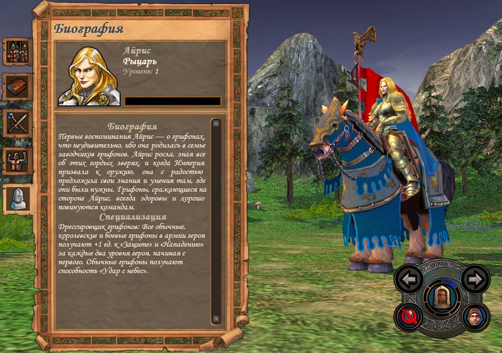
By the way, I drew Iris about a month ago - what do you think of this version?
Attachments 1
1 file attached • Total size: 705.8 KB
In reply to SRD
User Avatar
9 years ago
Auto-translated
SRD
I disagree here – in that case, the details will suffer, and the drawing won't be as noticeable because everything will merge into a single-color spot. If possible, the details should be of different colors, while still being harmonious and contrasting (a rough example – black/white – the colors harmonize and contrast without merging into one absurd spot).
By the way, I drew Iris about a month ago – what do you think of this version?

It depends on how you merge everything into one spot!

Iris has a normal saddle blanket, but what's up with her cloak and hair?!
In reply to psatkha
User Avatar
9 years ago
Auto-translated
psatkha
It depends on how you blend everything into one spot!

Iris has a normal cape, but what's wrong with her cloak and hair?
I want to rework the hair later, but what's wrong with the cloak? - I didn't touch the outline (it's the same as Isabel's), and the fabric isn't pale red, but yellow.
In reply to SRD
User Avatar
9 years ago
Auto-translated
SRD
I want to rework the hair later, but what’s wrong with the cloak? – I didn’t change the outline (it’s the same as Isabel’s), and the fabric isn’t pale red, it’s yellow.

In the screenshot, it looks more like light brown!

P.S. What’s wrong with this version from NHF?!

9 years ago
Auto-translated

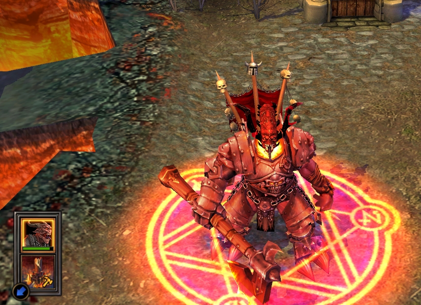
Made the colors more Inferno-like.
In reply to psatkha
User Avatar
9 years ago
Auto-translated
psatkha
In the screenshot, it looks more like light brown!
The screenshot shows its inner side – it is darkened (as if it’s in the shade) – the outer side of the cloak is yellow.
psatkha
P.S. What’s wrong with this version from NHF?!
I always imagined it in these colors, and not in blue (but the NHF version is also good).
In reply to SRD
User Avatar
9 years ago
Auto-translated
from this angle, you can see the cloak (and I also reworked the hair).
Attachments 1
1 file attached • Total size: 500.4 KB
In reply to Роман RRR
User Avatar
9 years ago
Auto-translated
Roman RRR

Made the colors more infernal.
Yes, perhaps this is better! It's a pity that the developers didn't bother to give him a movement animation(((
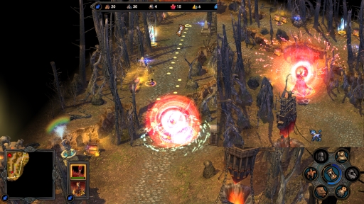
By the way, there is also a teleportation effect for the devil.
In reply to SRD
9 years ago
Auto-translated
SRD
By the way, there's also the teleportation effect on the Devil.
I wanted to use it, but I couldn't... It's only tied to the Devil ((( But yes, that one looks cooler!

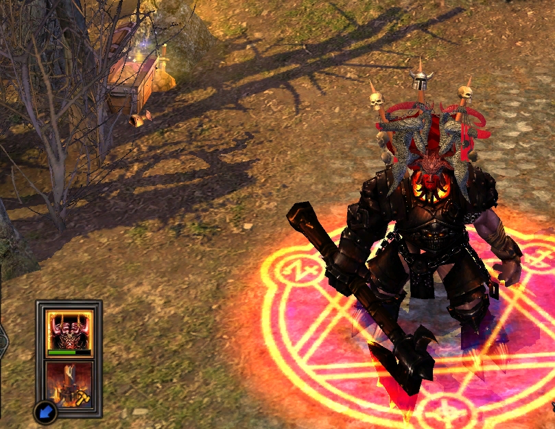
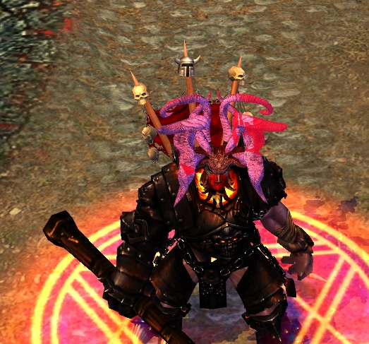
I found this head for the second hero))) It looks very similar!


Added 9 hours 50 minutes ago
3rd.
You can't find horns like the ones drawn, and honestly, the hero looks awkward in the picture.
My alternative:

I won't paint the horns purple either, it won't look good.
But the face and beard are similar and made in the same color! The beard is red, it's not visible in the screenshot...(((
For comparison:
In reply to Роман RRR
User Avatar
9 years ago
Auto-translated
Roman RRR
I won't paint the horns purple either, it won't look good.

The horns look better in black than the original ones from the icon! In principle, you can change the color on the icon - it's not a big deal! ;)

Statistics

Welcome our newest member: recijeb

Users Online 3 users 1339 guests