Connection ErrorBad RequestThis page went staleSession ExpiredSign in requiredForbiddenNot FoundToo Many RequestsServer ErrorBad GatewayService UnavailableGateway TimeoutHTTP Version Not Supported
Session Expired
Your session has expired. Please log in to continue.
Sign in required
You need an account to do that. Sign in or create one — it only takes a minute.
This page went stale
Your security token was rejected, usually because the page sat open too long or you signed in elsewhere. Nothing was saved. Reload the page and try again.
Request Failed
We encountered an issue while processing your request.
Please check your internet connection and try again.
Here we are, almost at the doorstep of the New Year, with only a week left until this glorious event.
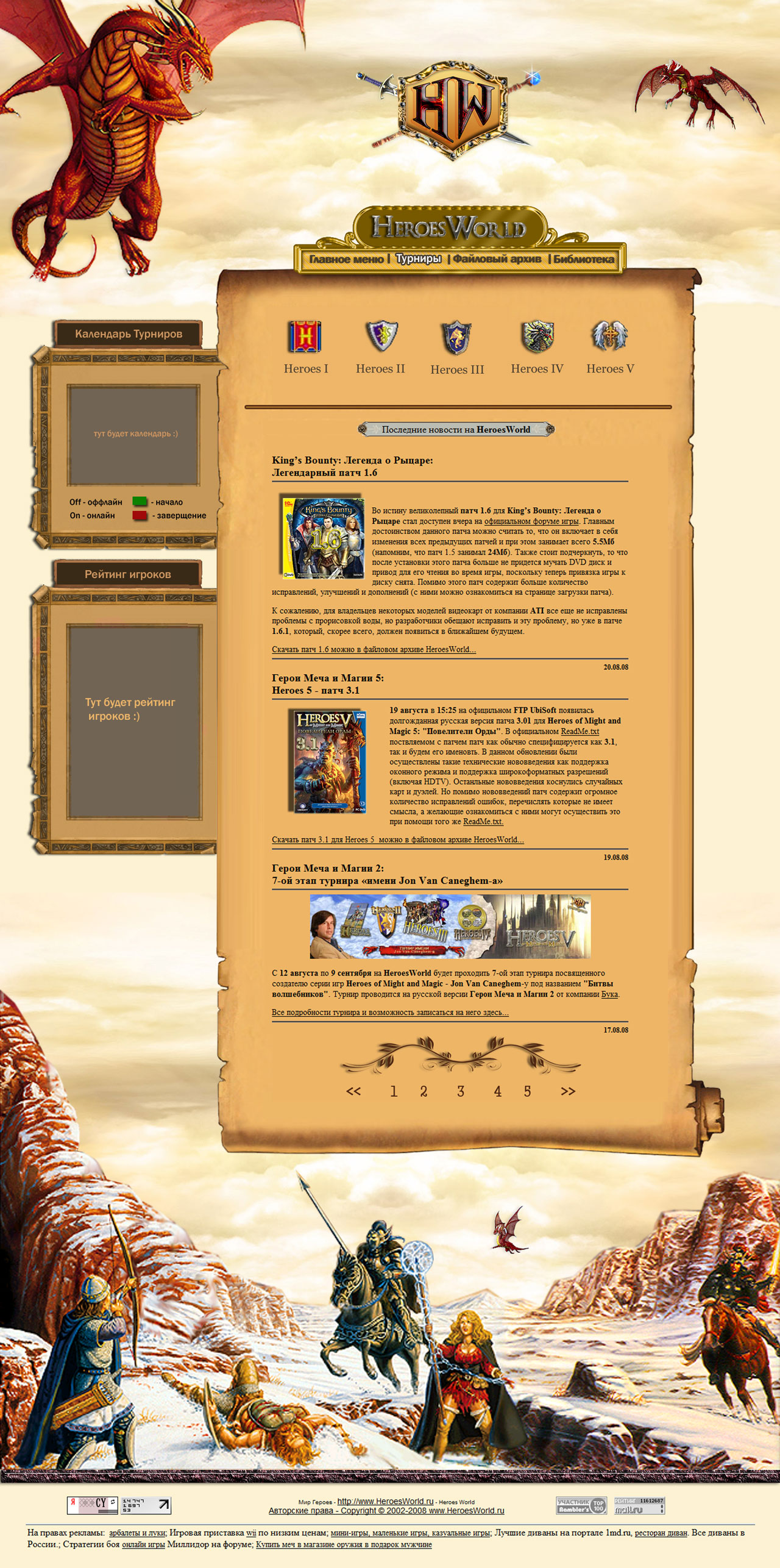
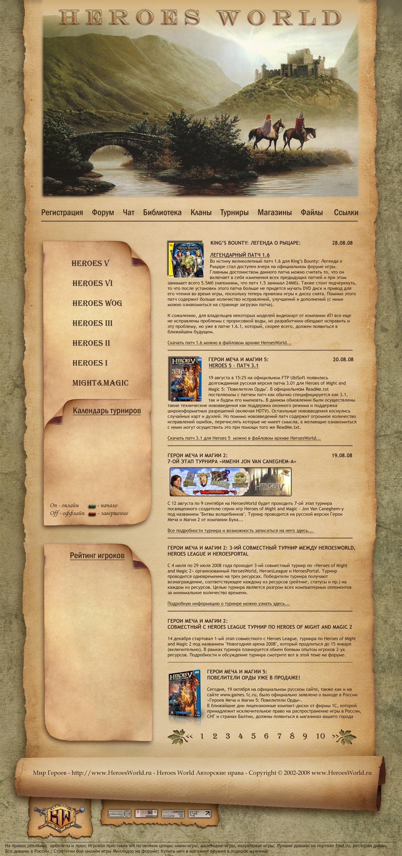
During the remaining week, those who were disappointed with the previous four skin options for HeroesWorld, those who haven't voted yet, and those who like one of the new options that appeared recently (No. 5 and No. 6) more than the previous ones and have already voted in the first poll can vote in the new poll, which opens from the moment this message is posted.
Let's go through it step by step:
Fonts:
Although the fonts aren't great in either version, they're much better in the 6th one... (maybe because the 5th one has a bright background that's harsh on the eyes and negatively affects the font).
Colors (background):
Okay, straight to the point... I like the 6th one more because, in my opinion, the colors are well-chosen, plus that gloomy shade adds to the atmosphere.
The 5th one looks like the previous versions... nothing interesting.
Images:
Well... the 5th one is just okay... and is that forum users killing each other at the bottom? (like: -Did you delete my thread? - Yes! - You..., die for that! *thwack* - No way, I have golden armor that gives +20 defense, and now you'll taste my moderator's sword! *thwack*...*blood gushes onto the snow, and the evil spammer falls dead*))))
In the 6th one, the image fits in terms of color and everything else. Plus, you can interpret it as the Castle being our Fortress, and the travelers being new users coming to us... XD
P.S. In the previous poll, I voted for the 3rd option, but now I'm ready to give it up in favor of the 6th...
(voted)
P.P.S. And it's good that it doesn't have anything from the 5th Heroes
The 6th option is better. The color scheme is more interesting and pleasing to the eye, and it doesn't strain the eyes, so you can spend a long time on the site.
6th option (variant – depending on who you ask) is, in my opinion, the most impressive and picturesque, and despite the grayish tones, it is not at all gloomy! I think it perfectly reflects the atmosphere of the hero world (HeroesWorld - eng.), the epic nature of the medieval era, and all the mysterious charm of ancient times! See! Even a hardcore spammer, usually capable of only "olololo pew pew, it's totally awesome, lol," was inspired to say such things! :) Because this skin has healing power! Now, HW will become a place of pilgrimage for %Usernames% from all over the world: the blind will see, the disabled will stand up and walk, the disheartened will find strength and will... In the end, in the 2012 presidential elections, they will choose the Creator, and heroes will be declared the state religion. Oh well, that's just a fantasy (a sick fantasy):D
Well... the 5th one is so-so... and at the bottom, are those forum users killing each other? (like: -Did you delete my topic? - Yes! - Oh, you..., die for that! *thwack* - No way, I have golden armor that gives +20 defense, and now you'll taste my moderator's sword! *thwack*...*blood gushed onto the snow, and the evil spammer fell dead*))))
Ahhh... I really don't like dragons; the sixth one was better... it had a nice, misty atmosphere. What I especially didn't like about the fifth one is the low-quality images :( (unless it's just a glitch on my end). But overall, I like both of these versions even more than the third one. They're more interesting.
So back off your rules, Back off your jive! Cause I'm sick of not living, To stay alive, Leave me alone! I'm not asking a lot - I just don't want to be controlled, That's all I want. All I want!
Good day to everyone ;) It's been a while since I last checked in(((But there were reasons for that)... So, I looked at all the options, and definitely 6 of them stand out in particular... and the 3rd one is not bad either! Let's start in order! 1) The color is chosen in such a way that it won't irritate the eyes or become boring! 2) Style! - The unfolding scroll creates the right impression! In the others (with the exception of the 3rd one) - IMHO - they just hang in the air! 3) The additional menus on the left (which is why I like style 6 more than style 3) are made in the form of detached pieces of the scroll, and not a full-fledged scroll! This option is more believable and draws you into the atmosphere of ancient times, heroes, etc.;) 4) Fonts! Well, it's not all that smooth here! As Ar already said
the fonts are not at a high level
! I partially agree! In style 6, the header is a bit lacking! - if it were done in the same font as everything on the left, it would create a completely different impression! P.S. Excellent styles, superb ideas, excellent execution! It's a pity that I didn't finish the work that was assigned to me(((... I sincerely apologize, I just don't have the time((( Sincerely ;)
Regarding the screenshots, I used to vote for the third one, but that was because I hadn't seen the sixth one. :) I really hope that the sixth option wins the poll.
Definitely, out of all of them, the sixth one is the best... It's the most beautiful and pleasing to the eye! I'm voting for it...
Если тебе не везёт в жизни, - играй в какую-нибудь другую игру:rolleyes: Лидер клана "Из многих единое" Приключения – это сплошные неприятности, только про них почему-то потом интересно вспоминать...
Personally, I think the 6th one is better; everything feels so calm and peaceful there. The beautiful landscape, the heroes seem to be returning home – it’s quite soothing, with no battles or skirmishes. It makes you want to sit down at the negotiating table, but in the world of heroes, you can’t avoid battles :smile14:. In the 5th one, the dragons are beautiful, but they seem a bit evil, and the guys at the bottom of the picture are up to something not very good, so I prefer number 6.
Небо – мольбы не ждёт Небо – угроз не слышит Небо – ведёт особый счёт Небо – тебя найдёт