Мой проект:
NVS 3.0 (Narron's Visual Solutions for HOMMV)
- Ссылка на скачивание мода;
- Ссылка на Компендиум NVS 3.0;
- Сообщество проекта в vk.ru

Posts from = Small mods that change the visuals =
Auto-translated
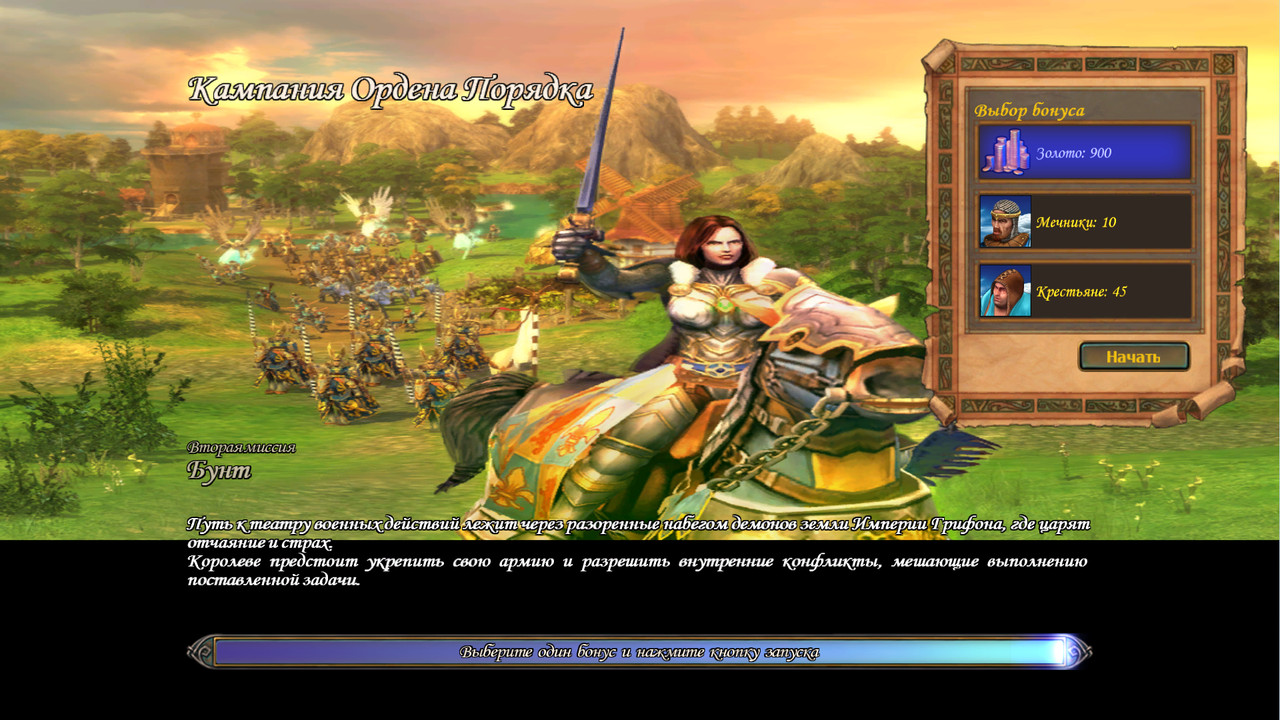
I was already happy when I saw the splash screens without distortion, but after installing the mod, I got this image.
I figured everything out; you provided an example for several scenarios for the campaigns, and the rest remained unchanged.
Here's a mod for all campaigns. It's quite substantial.
К. Прутков-инженер. Мысль № 77.
Многие вещи нам непонятны не потому, что наши понятия слабы; но потому, что сии вещи не входят в круг наших понятий.
© Козьма Прутков
Is the improvement achieved by increasing the resolution or by blurring? In my opinion, it's better to approach the elements more selectively. Smooth details definitely look better, but in other respects, the detail has been lost, and the color palette has suffered. This is clearly visible on the hilt of the blade and especially on the unicorn. The blade and the font are much better perceived. I'm judging based on the screenshots.
К. Прутков-инженер. Мысль № 77.
Многие вещи нам непонятны не потому, что наши понятия слабы; но потому, что сии вещи не входят в круг наших понятий.
© Козьма Прутков
К. Прутков-инженер. Мысль № 77.
Многие вещи нам непонятны не потому, что наши понятия слабы; но потому, что сии вещи не входят в круг наших понятий.
© Козьма Прутков
Mod to improve the quality of textures for displaying other players' progress.
Before - Attachment 69759 Attachment 69760 Attachment 69761
After - Attachment 69762 Attachment 69763 Attachment 69764
The idea is good, but it seems to me that there is not enough noise and sharpness. Perhaps even some vibrancy is missing in the cursors.
Мой проект:
NVS 3.0 (Narron's Visual Solutions for HOMMV)
- Ссылка на скачивание мода;
- Ссылка на Компендиум NVS 3.0;
- Сообщество проекта в vk.ru
I think it lacks noise and sharpness.
К. Прутков-инженер. Мысль № 77.
Многие вещи нам непонятны не потому, что наши понятия слабы; но потому, что сии вещи не входят в круг наших понятий.
© Козьма Прутков
The original textures have a lot of noise and artifacts, and it would be very difficult to improve the sharpness of the gradient color. I didn't want to deviate from the original, but the stepped color gradient really bothers my eyes.
Could I work on your mod in my spare time, colleague?
Мой проект:
NVS 3.0 (Narron's Visual Solutions for HOMMV)
- Ссылка на скачивание мода;
- Ссылка на Компендиум NVS 3.0;
- Сообщество проекта в vk.ru
К. Прутков-инженер. Мысль № 77.
Многие вещи нам непонятны не потому, что наши понятия слабы; но потому, что сии вещи не входят в круг наших понятий.
© Козьма Прутков
Narron - you can do anything, modify it, take elements from it, etc.
Thank you very much, colleague!
Мой проект:
NVS 3.0 (Narron's Visual Solutions for HOMMV)
- Ссылка на скачивание мода;
- Ссылка на Компендиум NVS 3.0;
- Сообщество проекта в vk.ru