Connection ErrorBad RequestThis page went staleSession ExpiredSign in requiredForbiddenNot FoundToo Many RequestsServer ErrorBad GatewayService UnavailableGateway TimeoutHTTP Version Not Supported
Session Expired
Your session has expired. Please log in to continue.
Sign in required
You need an account to do that. Sign in or create one — it only takes a minute.
This page went stale
Your security token was rejected, usually because the page sat open too long or you signed in elsewhere. Nothing was saved. Reload the page and try again.
Request Failed
We encountered an issue while processing your request.
Please check your internet connection and try again.
Error Details:
Share Link
= Small mods that change the visuals =Auto-translated
Screenshots would be nice... In BTD, Zobr added some high-quality azure dragons! And if it's just a recolor, I'll move the mod to the "Small Visual Mods" section.
A small mod that replaces the icons displayed when building a town.
Who might like it:
- Beginners
- People who don't play the game very often
- Those who are annoyed by the little houses
Who might not like it:
- People who are used to the standard color scheme
There used to be a similar mod on the all4heroes website that I really liked, but it disappeared along with the website. Unfortunately, I don't remember the name or the author.
Now I've found some time to recreate its idea with a few improvements.
I don't play Heroes very often, so I always get confused with the icons at the beginning. Besides, I don't like the little houses for a number of reasons. Their colors are very different from the color of the hammers, the angles of the hammers and houses don't match, and their size is also larger.
I worked with the color of the hammers, adding a little volume to them. The house was replaced with a castle icon, which has the same angle, color, and size (1 pixel higher) as the hammers. The castle icon on the minimap was used as the basis for the castle. The image was almost completely redrawn, with some proportions changed and details added.
I really wanted to keep the original color logic, but I couldn't.
Now the logic is as follows:
Green hammer - construction is possible.
Red hammer - not enough resources for construction.
Gold hammer - construction is completed this turn.
Gold castle - town construction is completed.
Installation: Unzip the archive. Place the *.pak file in the data folder.
P.S. If you want to rework it and/or use it in your mod, I don't mind. With attribution and on the condition that the project is free and not distributed with a pirated copy of the game.
Good afternoon!
I decided not to create a separate thread, but to add it to this one, since the mod is small but might appeal to some.
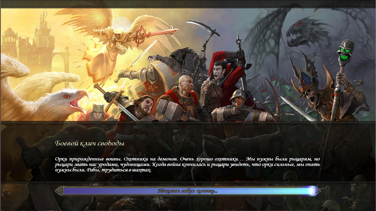
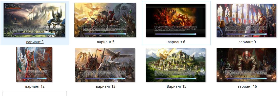
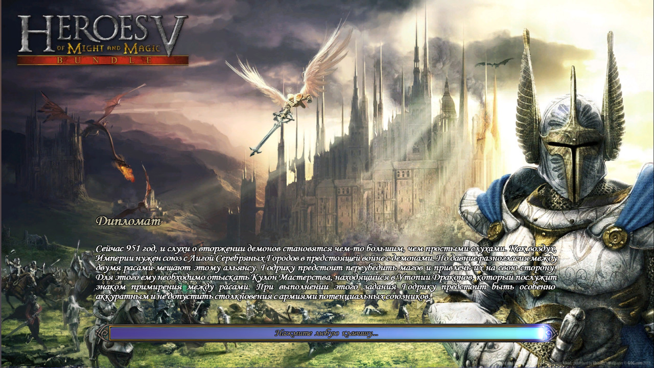
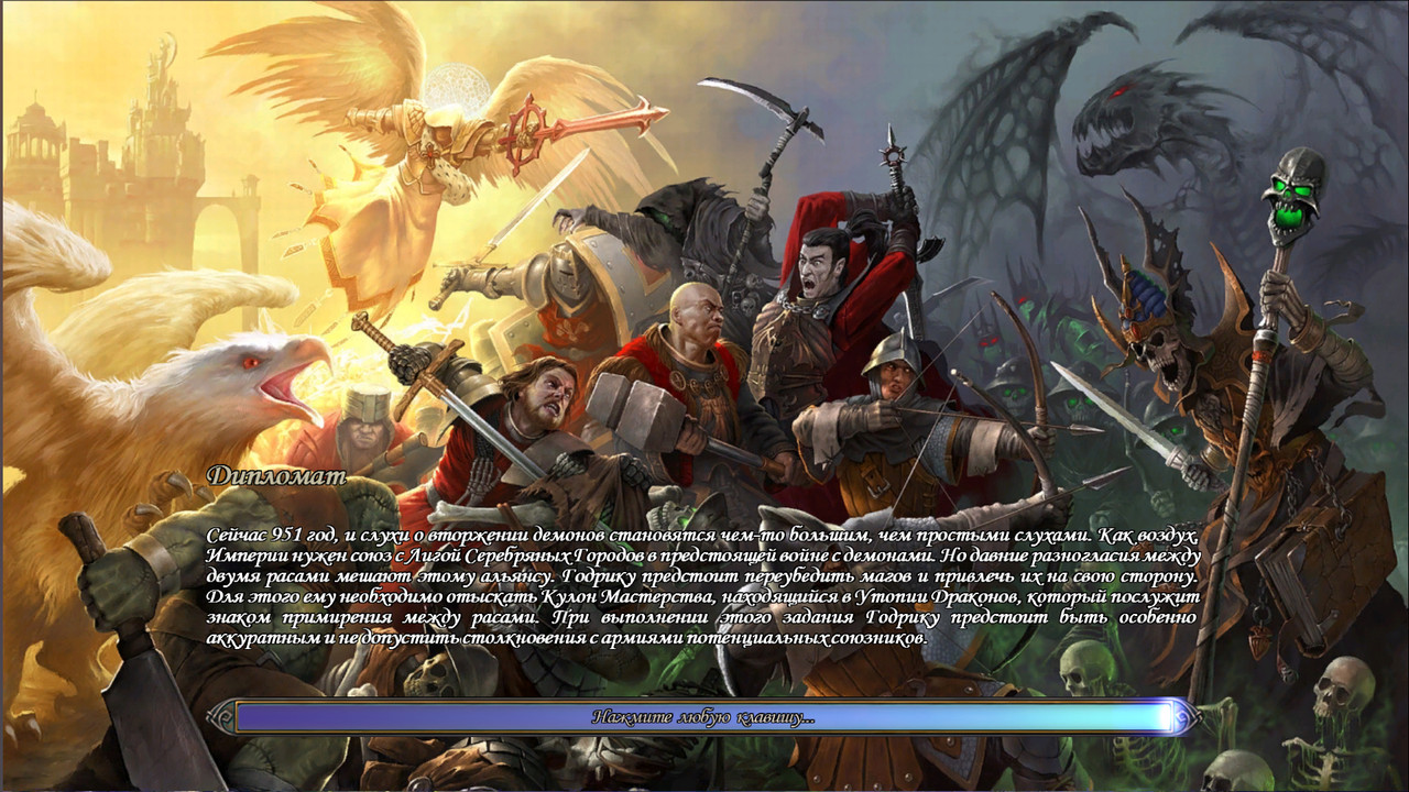
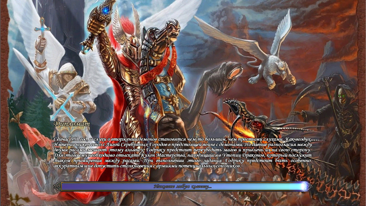
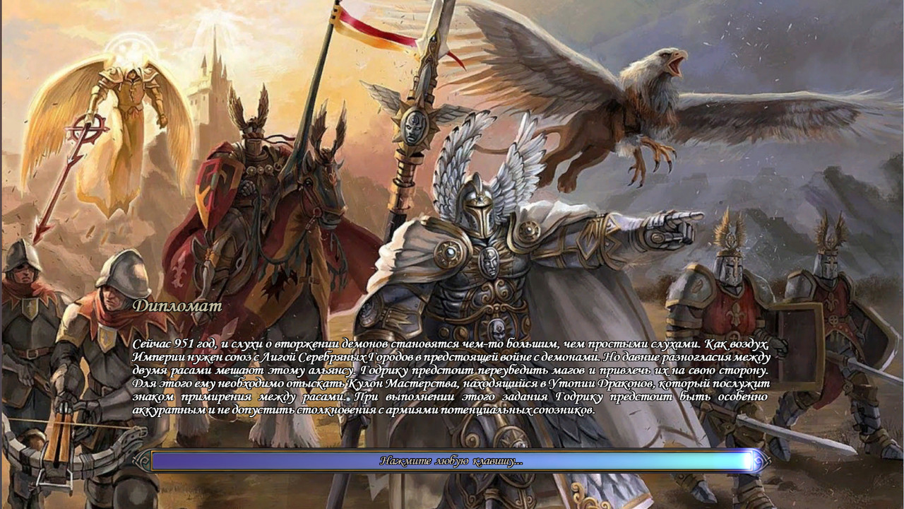
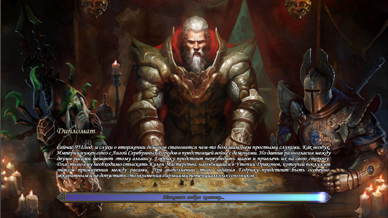
The mod replaces the loading screens for scenarios and generated maps, replacing the usual griffin image. There are several options, and I tried to choose images so that the scenario text is readable.
Link to download the mod35912131516
A slightly different design with field limitations.
6
I'm interested in your feedback, which option you liked the most.
How did you manage to set the aspect ratio to 16:9 when loading scenarios?
Added 54 minutes later
Thank you, man, for figuring it out and creating this. I've already adopted this technique for myself. I'll be implementing it in NVS, but only after my wife creates 14 artworks. As a placeholder for the scenarios, I used a wallpaper featuring Elrath and Malassa in battle.
It's hard to choose the best one from your pwlscreens. They are all interesting in their own way. The only issue is that with the frames, you can't predict – because different scenarios have different amounts of text in the description. In some cases, the text will overlap the frames.
How did you manage to set the aspect ratio to 16:9 when loading scenarios?
Added 54 minutes later
Thanks, man, for figuring it out and making this. I've already adopted this technique for myself. I'll be implementing it in NVS, but only after my wife creates 14 more artworks. As a placeholder for scenarios, I used a wallpaper featuring Elrath and Malassa in battle.
It's hard to choose the best one from your pwlscreens. They're all interesting in their own way. The only issue is that you can't predict the frame placement because different scenarios have different amounts of text in the description. Sometimes the text will overlap the frames.
The mod is based on the previously released image, but it had to be modified to fit the 1364x768 resolution. There's also a peculiarity; I don't know what it's related to, but the game wouldn't recognize the image I needed... Unfortunately, this trick doesn't work with campaign intro screens; it always crops them to a width of 1024.
I agree that the option with the bars didn't work well because of the dark borders. On one hand, the image immediately shrinks from the bottom, and on the other hand, the space occupied by the text will be different in different scenarios, so it doesn't look very good. I have an idea to simply darken the lower area for better text readability.
The mod is based on a previously released image, but I had to modify it to fit the resolution of 1364x768. There's also a peculiarity – I'm not sure why – but when I used the image I wanted, the game wouldn't recognize it... Unfortunately, this trick doesn't work with the cutscenes for campaigns; it always crops them to a width of 1024.
I agree that the option with the bars wasn't ideal; I didn't get the dark borders right. On one hand, the image immediately shrinks from the bottom, and on the other hand, the space occupied by the text will vary in different scenarios, so it doesn't look very good. I have an idea to simply darken the lower area for better text readability.
I made a 1366x768 version for myself, based on your work.
Is there a way to upload images without using Postimage, so that they can be viewed in a larger size?
P.S. My apologies, I just noticed the little triangles that open the images! The question is resolved.
I made a 1366x768 version based on your work for myself.
Is this specifically for the campaign? I wanted to do something similar for the base game. Here's a version with darkened colors. [spoiler=Version with improved text][/spoiler]
as for readability, it could select a text from the scenario with a lot of letters, see how much space it takes up, create a highlighted area of that size in the image, for example, a rectangle with rounded corners, and darken and slightly blur the area inside the highlight. It could also create a smooth transition from the highlight (darkened and blurred) to the main image, or leave this transition sharp.
Is this specifically for the campaign? I wanted to implement this for the base game as well. Here's a version with darkening.Version with improved text
For now, it's only for scenarios. I'll look into campaigns later.
as for readability, you could choose a text from the scenario that contains a lot of text, see how much space it takes up, and create a highlighted area of that size on the image, for example, a rectangle with rounded corners, and then darken and slightly blur the area inside the highlight. You could also create a smooth transition from the highlight (darkened and blurred) to the main image, or leave the transition sharp...
The best option, of course, would be to create a shadow around the text, as this effect exists in Word. This would allow for a contrasting background to be universally applied behind the text. I can't upload the images because the files are larger than 2.2 MB. If you want to see the artwork, I can provide a link to an archive. For a preview of the overall look and in this format, everything looks great.
Yes, the best option would be to add a shadow around the text (I don't know how, or if it's even possible). Word has this effect; then, a contrasting background would work universally behind the text. I can't upload the images because the files are larger than 2.2 MB. If you want to see just the artwork, I can post a link to the archive. For a look at the overall appearance, everything looks great in this format as well.
No, no, I've edited the message above – I saw the little triangles for opening the images, and everything is visible there, in a large size... Regarding the shadow, does that mean I need to edit the game's font for the loading screen of the scenario?
No, no, I edited the message above – I just noticed the little triangles for opening images, everything is visible there, in large size... regarding the shadow, does this mean that I need to edit the game font of the scenario loading screen?...
Yes, that's correct, but I don't know how to do it (if it's even possible). I'm not very familiar with code, maybe someone with more experience can help.



 Rumpo
Rumpo




 Narron